Capture the hearts of your users with high-quality screenshots with ASO
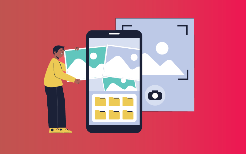
One of the most important aspects of ASO is to provide ample and high-quality screenshots throughout your app page.
Screenshots are an essential feature of ASO strategies. They can help drive conversions and make your app pages more appealing. However, to make sure the AI is successful there are some guidelines to follow. For example, the AI is not supposed to use jargon or be unclear from the get-go since it will create a negative impression on potential users and won’t convince them to try your product.
ABOUT SCREENSHOTS
It’s no secret that Visual assets have a meaningful impact on user behaviour. According to Storemaven, App Store users are 10x more likely to scroll through the Gallery than read the app’s description. Creatives are more attention-grabbing and will deliver your message.
With the store screenshot, it’s not always clear how effective it will be for your particular store. However, screenshots are never more relevant than when the user is looking at your product page. If you don’t have a preview video, will show up anyway in search results, on your app’s home screen, and on the front page of the app store. This way, potential users that might not have clicked on the link for some reason will get to see them. According to SplitMetrics, less than 2% of users tap ‘read more.
One simple and powerful way to get your message across is with a screenshot. And, as a matter of fact, people only look at the first impression frame of an app store page! Scrolling beyond this preview tends to be very rare since most people see what they want to see in that brief moment
We explore how first impressions in app stores work and how they can help you to boost your conversion rate with proper screenshots.
APP STORE and PLAY STORE GUIDELINES
However, to enjoy the benefits of well-thought screenshots, you will need to comply with Apple and Google’s rules.
To make sure your website is in the Google Play Store, make sure you are meeting their requirements.
The screenshot dimensions have to be within a range of 320px minimum and 3840px maximum. These are the screenshots you can upload for your new app. There should be at least 2 and no more than 8. They must be in JPEG or PNG format and should have an aspect ratio of 16:9 or 9:16. Tablet devices will need screenshots with different resolutions – Namely, 320×480 for Nexus 7 and 1280×800 for iPad 4 or newer iPads
To get recommendations on the Play Store:
- At least 4 screenshots for apps and 3 screenshots for games where at least one screenshot shows the in-game or in-app experience. Please, do not use a call to action phrases.
- Optimize your screenshots by translating their text and making sure that taglines don’t cover more than 20% of the image.
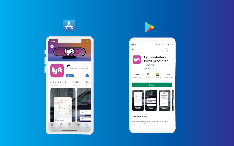
Apple Store requirements
Apple’s App Store screenshots need to fulfil the following requirements:
- You can include up to 10 screenshots per submission.
- The aspect ratio and dimensions are device dependent and can be checked on Apple’s dedicated page. There are 3 default & mandatory screenshot sizes:
- 6.5-inch iPhone screenshots with corresponding portrait and landscape sizes
Also, Apple has guidelines for what they can allow in-store marketing campaigns:
We don’t allow any talk of blood, murder, assault, illegal sex acts or drugs, or anything that could be seen as obscene. Realistic guns are also forbidden.
WHAT MAKES GREAT APP SCREENSHOTS?
When you’re making screenshots for your app, there are a lot of things to take into account. Should you use landscape or portrait view? What if you want to make the screenshot more intriguing by putting in some tilt? These aren’t requirements, but they can help make users understand what your app is about even more.
When designing screenshots, it’s essential to use the most important features and put them in the first few. These are what likely appeal to the user the most and rank as popular with viewers.
It’s also important to mention that screenshots are the first thing the user sees: they don’t read the description, so you need to make a good impression. (#bn)
They should be clear and easily understandable so that viewers don’t get overwhelmed with too much info at once. Having no more than one feature per screenshot is a good strategy. According to Simon Thillay, clutter your screenshots if you’re finding success in Japan.
While the information should be readable, it’s important to spread the word too. Making sure the font is large and easy to read will go a long way toward that.
Screenshots should be coherent with each other and make your product look appealing to viewers. Doing so means that they won’t have a rough time reading through your content.
It’s important to have a strong presence on your home page. Your colours need to match your brand personality so it looks like you. For example, many app marketers use white backgrounds with bright colours. This can help you stand out but be careful to make sure that your text is easy to read and doesn’t get drowned out by the background
Here are some tips to help you create the perfect screenshots for your social media platform.
- We will start to see the first screenshots very soon, this is why it’s so important to let people know about their features in them.
- The branded screenshots you provide to your clients need to be of a high quality so your company always comes off better!
- Choose a text colour that contrasts with your background colours to make it easier to read.
- Always A/B test your screenshots, you never know which option users will prefer.
- Don’t use the same creatives in both stores. That’ll lead to fewer installs.
- Localize your creatives by including the keywords and search queries in screenshots. This will remind potential customers of the need they were looking to fulfil with your service/product.
- If you’re not as popular in search results as your competition, try giving yourself a different background colour. It’s usually enough to help you stand out.
- Your font should be big enough to read comfortably on the results page.
- Screenshots are essential, but sometimes less is more. Aim your screenshot at Western audiences to circumvent confusion and be more successful.